- 图表插件
- Echarts 通用图表
图表插件
Echarts 通用图表
Apache Echarts 是一个免费的、功能强大的图表和可视化库,提供了简单的方式来为你的产品添加直观、交互式和高度可定制的图表。
在 xObserve 中,为了便于使用,我们已经将 Echarts 的配置项封装成一个函数。
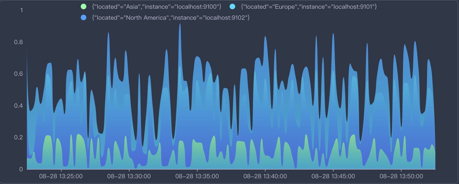
先来看看一个简单的例子,我们将使用 Echarts 来绘制一个如上所示的折线图。
Echarts 设置 -> 设置 Echarts options
在这个函数中,我们需要做的就是根据从数据源查询到的数据,设置 Echarts 的配置项。
点击 编辑函数,填入以下代码:
// setOptions return echarts.Options, it is directly passed to a echarts chart.
// Find more options examples: https://echarts.apache.org/examples/en/index.html#chart-type-line
// data: SeriesData[] which is the standard data format in xObserve
// thresholds: ThresholdsConfig[] | null
// colors: color palettes using in xObserve
// echarts: imported echarts.js module
// loadash: imported loadash.js module
// moment: imported momen.jst module
// colorMode: "light" | "dark"
function setOptions(data, thresholds, colors, echarts, loadash, moment, colorMode) {
    const colorList = [
        ['rgb(128, 255, 165)', 'rgb(1, 191, 236)'],
        ['rgb(0, 221, 255)', 'rgb(77, 119, 255)'],
        ['rgb(55, 162, 255)', 'rgb(1, 191, 236)'],
        ['rgb(255, 0, 135)', 'rgb(135, 0, 157)'],
        ['rgb(255, 191, 0)', 'rgb(224, 62, 76)'],
    ]

    const legend = []
    const seriesList = []
    if (!echarts) {
        return null
    }

    for (let i = 0; i < data.length; i++) {
        const s = data[i]
        legend.push(s.name)
        seriesList.push({
            name: s.name,
            type: 'line',
            stack: 'Total',
            smooth: true,
            lineStyle: {
                width: 0
            },
            showSymbol: false,
            areaStyle: {
                opacity: 0.8,
                color: new echarts.graphic.LinearGradient(0, 0, 0, 1, [
                    {
                        offset: 0,
                        color: colorList[i] ? colorList[i][0] : colors[i % colors.length]
                    },
                    {
                        offset: 1,
                        color: colorList[i] ? colorList[i][1] : colors[i + 1 % colors.length]
                    }
                ])
            },
            emphasis: {
                focus: 'series'
            },
            data: loadash.zip(...s.fields.map(f => {
                if (f.type == "time") {
                    return f.values.map(v => v * 1000)
                } else {
                    return f.values
                }
            }))
        })
    }

    //!!!ATTENTION!!!
    // We need to create a new options Object to return,
    // because only a new object can trigger react update!
    return {
        color: colorList.map(item => item[0]),
        tooltip: {
            trigger: 'axis',
            axisPointer: {
                type: 'cross',
                label: {
                    backgroundColor: '#6a7985',
                }
            },
        },
        legend: {
            show: true,
            data: legend
        },
        grid: {
            left: '3%',
            right: '4%',
            bottom: '3%',
            top: '5%',
            containLabel: true
        },
        xAxis: [
            {
                type: 'time',
                boundaryGap: false,
                axisLabel: {
                    formatter: (function (value) {
                        return moment(value).format('MM-DD HH:mm:ss');
                    }),
                },
                splitNumber: 5,
            }
        ],
        yAxis: [
            {
                type: 'value',
                splitLine: {
                    show: false
                }
            }
        ],
        series: seriesList
    }
}
在上述代码中,做了以下事情:
- 1. 将传入的
SeriesData最终格式数据转换为 Echarts 所需的数据格式. - 2. 返回 Echarts 需要的 options 配置
总之, xObserve:
- 从数据源查询
SeriesData类型的数据,例如 Prometheus. - 将这些数据传入
setOptions函数, - 函数将
SeriesData转换为 Echarts 需要的格式 - 返回 options 对象 并将其传递给 Echarts 实例以渲染图表。
交互
Echarts 图表一样可以设置交互事件,例如点击事件:
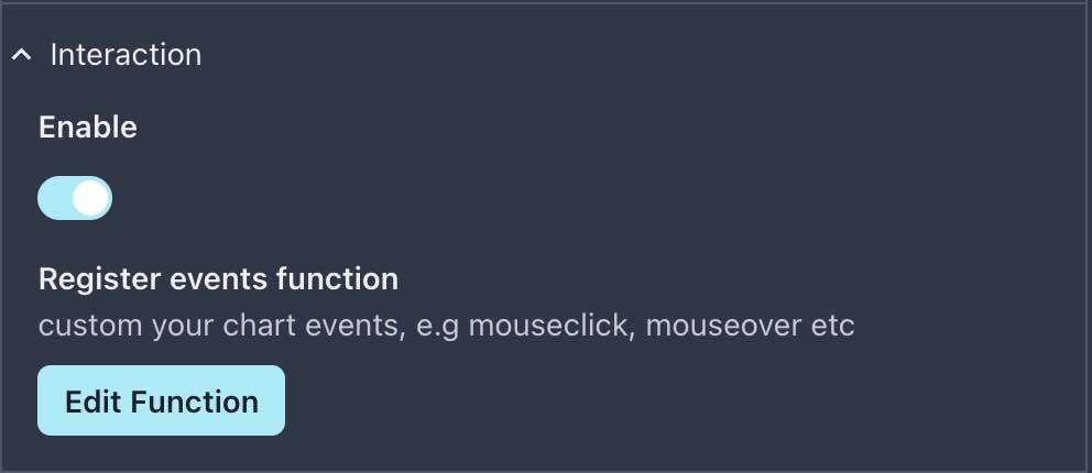
点击 编辑函数,你可以看到默认的函数体如下:
// In registerEvents, you can custom events on your chart, e.g mouse click event, mouse over event etc.
// chart: a instance of echarts, you can call echarts apis on it
// options: result of setOptions function
// Find more examples: https://echarts.apache.org/en/api.html#events
function registerEvents(options, chart, navigate, setVariable, setDateTime, $variables) {
    // !!!!!!!ATTENTION! You must unbind event handler first!
    // Because each time the options changeds registerEvents function will be called once
    // If we don't unbind event, next time you click the chart will trigger N  click event ( N = Number of times the options changes)
    // Rather than unbind all 'click' events, you can also unbind an specific handler: https://echarts.apache.org/en/api.html#echartsInstance.off
    chart.off('click')
    chart.on('click', function (params) {
        console.log(params)
    })
}
不错,xObserve 已经为我们定义了一个基本的点击事件,让我们试着点击一下图表,看看会发生什么:
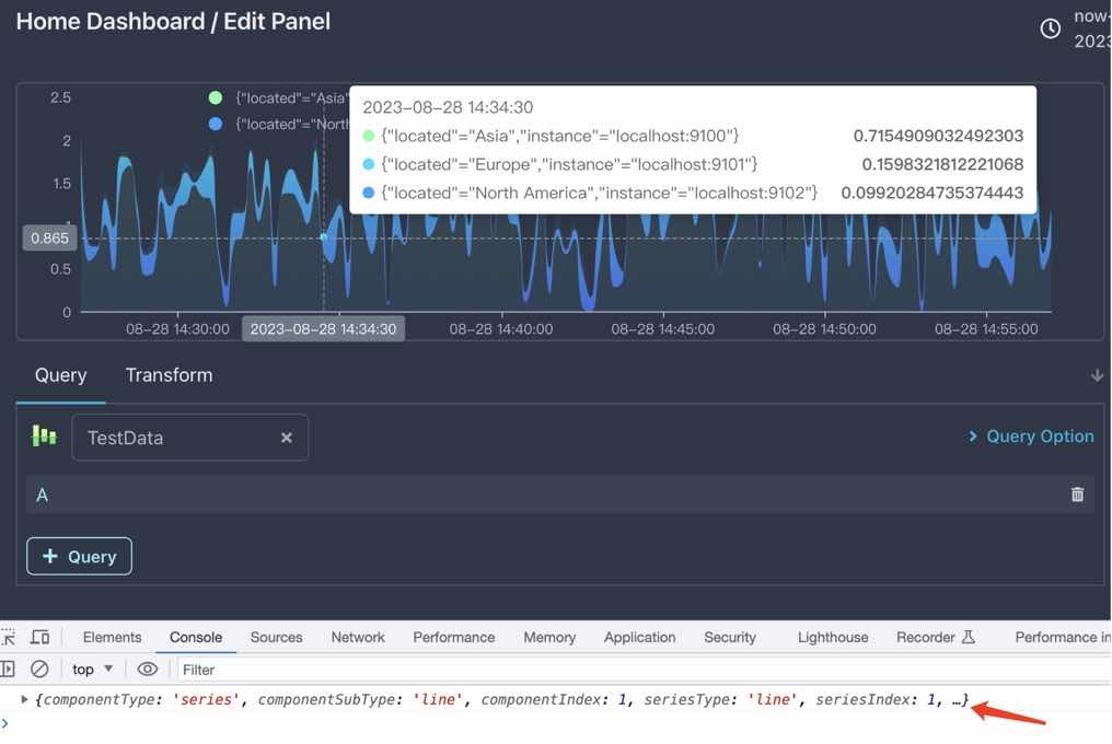
如上图所示,我们点击了图表上的一个点,xObserve 将会在控制台输出点击的点的信息。
更多示例
下面是一些更多的示例,你可以直接复制到 setOptions 函数中,然后点击 保存 按钮,即可看到效果。
所有的 Echarts demo 可以在这里查看
百度地图
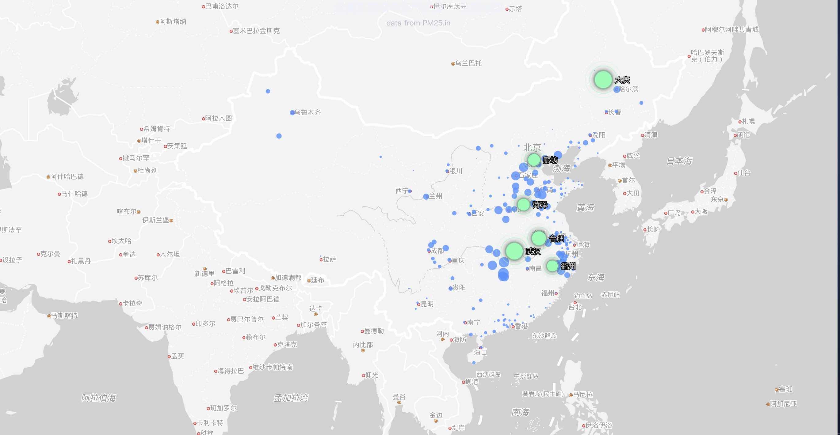
百度地图比较特殊,你需要做完成一些配置才能使用:
- 在
xobserve.conf文件中启用Baidu mapSDK
panel:
  echarts:
    enable_baidu_map: true
baidu_map_ak: 'AK for Baidu map, apply from https://lbsyun.baidu.com/apiconsole/key#/home'- 将 Github gist 中的代码拷贝进
setOptions函数中
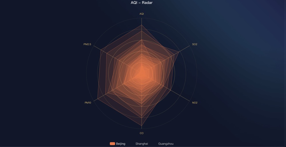
雷达图
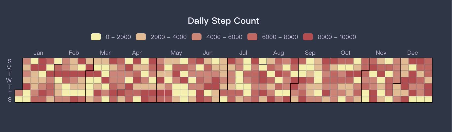
日历热力图
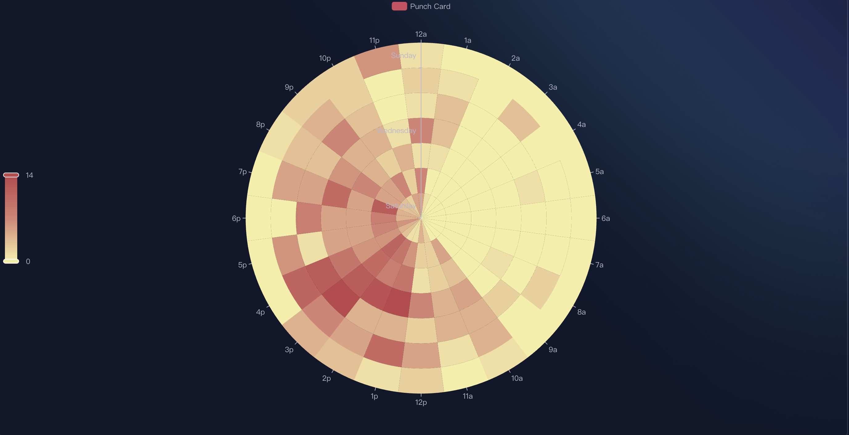
极圈热力图